Friday, December 21, 2012

2013 Changes to Print Products

Shadow Horse Studios LLC and Glass Eyed Pony Photography will be utilizing new papers for the 2013 year. It is very important for those artists who market museum quality archival works to know the differences in the papers they are using. True archival quality matters to high end collectors with the intentions of purchasing artwork and prints that will be insured and past down through generations. Art is an investment to these collectors. Archival or museum papers are made with a fiber source, such as 100% cotton rag, that will last for centuries WITHOUT CONSERVATION. Acid-free papers are based on cellulose fiber and will eventually yellow as their buffering is exhausted, depending on atmospheric conditions where they are stored and displayed. Although conservation is possible, their lifespan without conservation should be measured in decades, not centuries.

Because digital art is ultimately preserved in a digital format, not on paper, most people mistakenly feel that the expense of a museum paper is not always necessary. While it is true that under good conditions, with archival grade inks and proper storage and display, acid-free cellulose papers can last more than 20 years, this is not ideal for the invested collector who is looking for museum quality archival works that last generations.


For all giclee fine art prints the new papers we are utilizing here in the studio for all  prints and greeting cards starting january 1, 2013 are as follows:


Canson Infinity Arches Aquarelle Rag
The world’s No. 1 mould-made watercolor paper is now available for the digital fine art market, lending a unique and unrivalled character to the fine art reproduction of traditional artwork and photographs. Internally buffered and acid-free, it was designed to meet the longevity requirements of galleries and museums.

A genuine 100% rag watercolor paper, Arches Aquarelle Rag possesses the unique structure, surface texture, and warm white tone that demanding artists expect from a traditional fine art paper. It’s compatible with pigmented and dye inks, dries instantly, and is water-resistant. The absence of optical brightening agents ensures consistency for generations.


Canson Infinity Arches Velin Museum Rag
For centuries, Arches Velin Museum Rag has been chosen to create lithography, intaglio etchings, engravings, and collotypes by world-renowned artists. Today, Arches Velin Museum Rag is available for the inkjet fine art and photograph market.
This mould-made paper has a unique, fine-grained, smooth surface and structure, and a pure white tone that is ideal for sophisticated photographs, museum-grade applications, and fine art printmaking.
Arches Velin Museum Rag is compatible with pigmented and dye inks, dries instantly, is water-resistant, and contains no optical brightening agents. Internally buffered and acid-free, it was designed to meet the longevity requirements of galleries and museums.

Canson Infinity BFK Rives
The world’s No. 1 traditional mould-made printmaking paper is now available within Canson’s Infinity Digital Fine Art & Photo portfolio.
BFK Rives has a unique, fine-grained smooth surface and structure, and a pure white tone that is ideal for sophisticated photographs, museum-grade applications, and fine art printmaking.
It is compatible with pigmented and dye inks, dries instantly, is water-resistant, and contains no optical brightening agents. Internally buffered and acid-free, BFK Rives was designed to meet the longevity requirements of galleries and museums.

Canson Infinity Edition Etching Rag
Canson Infinity Edition Etching Rag is a 100% cotton mould-made fine art paper that is reminiscent of the original etching and printmaking papers. By using natural minerals in its manufacture, Canson has developed a smooth-textured paper with the purest white tone in the industry, high paper shade stability, and a resistance to aging.
This museum-grade paper assures deep blacks, excellent image sharpness, and optimum color gradation, and its slight grain makes it ideal for printing detailed work, color photographs, and black-and-white portraits.
Edition Etching Rag is compatible with pigmented and dye inks, dries instantly, is water-resistant, and contains no optical brightening agents. Internally buffered and acid-free, it was designed to meet the longevity requirements of galleries and museums.

Canson Infinity Museum Canvas Water-Resistant Matte
This traditional, museum-quality, 100% archival cotton canvas has a natural white tone optimized for pigmented inks. Combining modern technical excellence with the texture, feel, and body that only an all-cotton canvas can deliver, it offers the highest quality for the most discerning of reproductions.
It is free of optical brightening agents, with a premium, coated, matte-textured surface that is ideal for giclée applications. Water-resistant and UV-resistant, it can be stretched and mounted with ease.

Canson Infinity Platine Fibre Rag
Platine Fibre Rag is the combination of the latest microporous coating with the premium 100% cotton platinum paper that Canson has supplied for years to the original Platinum and Platine photographic market.
Setting the benchmark for digital darkroom papers, Platine Fibre Rag provides the aesthetic and feel of the original F-Type Baryta Fibre paper, possessing a true pure white tone without using optical brighteners that are known to affect the longevity of digitally produced images.
Platine Fibre Rag’s extremely high Dmax and exceptional gray tones make it the product of choice for black-and-white and color photographic prints. It is compatible with pigmented and dye inks, and internally buffered to resist gas fading and maximize the conservation of prints. It dries instantly and is water-resistant.

Canson Infinity Rag Photographique
Rag Photographique is a 100% cotton, museum-grade white fine art paper developed by Canson to meet the longevity requirements of the digital fine art market. The natural minerals used in its manufacture render an extra-smooth white surface with a sensual feel and one of the highest Dmax ratings available. It is ideal for fine art photography as well as fine art printmaking.
Rag Photographique is compatible with pigmented and dye inks, dries instantly, is water-resistant, and contains no optical brightening agents. Internally buffered and acid-free, it was designed to meet the longevity requirements of galleries and museums.

Moab Entrada Digital Rag Paper
These 100% cotton, smooth, double-sided papers are beautiful surfaces for fine art prints that will last a lifetime.
Bright White — Reproduces vivid color and maximum contrast for exceptionally detailed prints. Bright White is compatible with dye and pigmented inks.
Natural — A soft white sheet created with no optical brighteners. Natural is ideal for black and white images, and it is compatible with dye and pigmented inks.

Moab Lasal Photo Paper
Lasal is a professional grade of digital photo paper featuring brilliant whiteness, excellent image sharpness, and good color density. Lasal papers are universally compatible with the widest range of dye-based and pigment-based inks.
These papers can be laminated with both hot and cold presses and are perfect for general photography, portraiture, presentations, posters, graphic art reproduction, as well as signage. Neutral pH and acid-free. Made in the USA.
Lasal Exhibition Luster 300 — This is a heavyweight, single-sided, ultra-white luster paper that is ideal for gallery and exhibition prints. A new, fourth-generation resin coating produces an extra-wide color gamut never before seen in a luster paper. Named after the Lasal mountains, whose snowy peaks tower above the Moab, Lasal Exhibition Luster keeps true to its namesake, incorporating many of the elements found in the surrounding Moab environment — pure crispy whites and deep, luscious colors. 11 mm. 300 gsm.
Lasal Photo Gloss 270 — This bright white sheet features an instant-dry smooth gloss surface that is also smudge and water resistant. 270 gsm.
Lasal Photo Matte 235 — An instant-dry paper that is double-sided with a smooth, matte surface. Water resistant. 235 gsm.

Moab Somerset Photo Enhanced Inkjet Paper
Digital prints deliver greater resolution than traditional lithographic prints, and offer a wider color range than serigraphy. Reproduce your own masterpieces...or create new ones with a collection of fine art papers.
Somerset Photo Enhanced papers are suitable for most desktop printers (inkjet or bubble), yet deliver museum-quality reproduction and archival quality.
Photo Enhanced Velvet — The answer for artists who demand crisp "photo quality" reproduction without sacrificing the luxurious feel of fine art paper. This radiant white paper, combined with high-quality ink, yields exceptional depth, and rich, vivid colors that grab the eye. 225 gsm.

We are now offering our photography clients an affordable option to our giclee fine art prints with the introduction of our C-print line, printed with a Chromira Digital Printer.

Just what is a C-Print?

From Wikipedia, the free encyclopedia:
http://en.wikipedia.org/wiki/Chromogenic_color_print
Chromogenic color prints are full-color photographic prints made using chromogenic materials and processes. These prints may be produced from an original digital image.

The first commercially available chromogenic print process was Kodacolor, introduced by Kodak in January of 1942. Kodak introduced a chromogenic paper with the name Type-C in the 1950s, and then discontinued the name several years later. The terminology Type-C and C-print have remained in popular use since this time. The chemistry used to develop chromogenic prints today is known as RA-4. Kodak Endura is one of the major professional chromogenic print papers.

The class of color photographic processes known as chromogenic are characterized by a reaction between two chemicals to form (or give birth to) the color dyes that make up a photographic image. Chromogenic color images are composed of three main dye layers—cyan, magenta, and yellow—that together form a full color image. The light sensitive material in each layer is a silver halide emulsion—just like black and white papers. After exposure, the silver image is developed (or reduced) by a special color developer. In this reaction, the color developer in the areas of exposed silver are oxidized, and then react with another chemical, the dye coupler, which is present throughout the emulsion. This is the chromogenic reaction—the union of the oxidized developer and the dye coupler form a color dye. Different dye couplers are used in each layer, so this same reaction forms a different colored dye in each layer. A series of processing steps follow, which remove the remaining silver and silver compounds, leaving a color image composed of dyes in three layers.

Prints can be exposed using digital exposure systems yielding a digital C print. These are exposed using LEDs on light sensitive photographic paper and processed using traditional silver based chemistry. These digital systems expose the paper using red, green, and blue lasers or light emitting diodes, and have the capability of correcting paper sensitivity errors.


All C-Prints are printed on Kodak Archival Supra Endura Professional Photographic Paper which has an extraordinary color gamut and state-of-the art image stability and is available in Glossy, Matte, Lustre, and Metallic.


Tuesday, December 11, 2012

The Echoes

I am falling back to something sentimental and difficult.

I am returning to the photographic work of a man I loved, admired, and hated.

A tragic something...
and deeply personal

It is a visual journey with poetry of two lives-two journeys taking place at two very different time periods.
Forgiveness? That is a thought that I carry with me on this journey and perhaps you will notice the complexity of this word during the exploration I do with this series.

I am combining my methods of photographic artistic expression with the images belonging to my grandfather, also a photographer.


~His Love~

Only one of many
an apature eye
capturing
beauty (ies)
Doing more than seeing.
She wrote
tragic love notes
set them to flame
watched then burn.
The fire
was easier to bear
than letting go
of the oceans
her eyes
held onto.

~her love~
the one and only


Sunday, December 9, 2012

Art Tool or Art Reference: A Copyright Thing


BEFORE MY STUDIO SHOP GOES LIVE IN 2013 this is a
Note To EVERYONE


I have changed my texture and action usage agreement:

You can use my TEXTURES and ACTIONS resources anywhere and however you want in your artwork and photography and in pre-mades!


That includes:

 -Scrapbooking, Fine Art, Crafting, Digital Art, Illustration, etc
 -ANY other commercial use or non-commercial project.
 -You do not have to alter/change it to use them for these purposes.
 -*Premades* My textures and actions can be used in pre-mades with significant changes!

PLEASE, please don't redistribute and sell as your own RESOURCE UNLESS you make significant changes. You are not allowed to claim as your own or sell my textures or actions in their original state.
*This is a new agreement that carries over into the licensing of all my textures and actions when purchases and downloaded and applies to my giveaways from the past to present.

The reason I have made this decision is partly due to the nature of the "monster" when it comes to selling textures and actions. I am continually being informed of people stealing them and really, while I appreciate the "watch dogs" in the community, it becomes much too time consuming  to keep up with. Many textures out in the market have "similar" qualities and looks and often times people are reporting things to me that are in all actuality NOT MINE.

Secondly, I spoke to my own legal representative in regards to the copyrights of such "resources" that has left me rather, well, stunned, but I get it, and I understand now. I can see why there is a huge mass of confusion regarding the copyrighting of "resources". Stock Tools are different from STOCK REFERENCES as I have been informed. I will do my best to explain what I learned in regards to this aspect.

Texture and Action resources are not looked upon the at same as actual STOCK photos (photographs of people, places, things, etc) for the reference and or editorial market are. Those have recognizable subjects are treated under the copyright law quite differently than just action and texture resource. Textures and actions are labeled as art tools, not reference materials. What's the difference?

Here is how I will break it down for your understanding:

Let's start with textures:

Textures are created by an artist for use as an "art making" tool for other artists. It is a tool, much like a crayon. Only in its original form is it truly able to be "copyrighted". If this was not the case then every artist would have to license usage agreements for EVERY WORK OF ART THEY CREATED USING THAT TEXTURE! That means an artist who has purchased a texture can in fact DO WHATEVER they want with it, within their artwork and the creation of other works (even additional "tools" they want to sell).

Let's say, I have a red crayola crayon called Rose Red, that name is copyrighted to me.I may have a secret forumula used to create that red, but in all actuality, everyone has the "ingredients" to create a red crayon of their own, and by all accounts can do their best to match my Rose Red, through their own experimentation. The crayon was created as an art making TOOL, not a "reference". Anyone can take a red crayon and melt it down and mix it with other crayons or waxes or paints, what-have-you, and sell their creation in any form, including another "tool", yes that is right- they can sell the outcome of that "experiment", even if it is another texture.

THE COLOR RED cannot be copyrighted. I can make my own mix of red that may be similar even nearly exact but that is my red, and I can call it Royal Red. That is why paint companies when creating paints of their own (outside traditional paint names like Ochre etc) can only "copyright" the name of their paint and to some extent the "secret" formula. Anyone can take paints and mix colors to create paints that are similar to colors already created.

Now Let's Talk Actions:

Actions are just recorded steps that ANYONE can do themselves in the program they are using, be it Adobe Photoshop or Lightroom etc. The only thing that is copyrighted in actions is the actual name given to the "recording" the creator has chosen  and the way the creator as organized/tweaked the steps inside that action.

Let's pretend I am Rembrandt and I have an apprentice, I teach my apprentice my step by step method I use to mix paint, how I hold brushes while I a paint, and all the "other steps" I take to create a painting with the materials that everyone already has at their disposal.

Photoshop, Lightroom, and all these fancy computer programs have the tools already built in for your disposal to create all the steps that are recorded in the actions, they allow you to purchase additional plug-ins etc to supplement the tools already there. So, when I copyright an action, I am copyrighting the name and the "set" of that action. I cannot prevent the additional tweaking that customers do to my actions, including but not limited to, re-recording my actions with new tweaks and steps.

Textures, Actions, and other "art tools" made for artists to create with are not copyrightable the same way STOCK IMAGES ARE. Reference "stock" images are created to be used as a reference source for all traditional and or digital works where the final completed image takes influence from the look/feel/mood of the subjects within the referenced image or images. Artists who use stock images HAVE TO LICENSE for usage. (buyout exclusivity, dated/timed, general market, etc).

Textures, actions, and presets do not fall into the "reference" category according to the way they are defined by law for usage rights, as they are deemed as TOOLS and not reference. I can only imagine the paperwork that would entail from licensing usage agreements with every single artist for every artwork they create with that texture and or action preset in addition to commercial usage rights that entail from running prints and editions other editorial commercial work of their completed works that contain all the actions and textures (in some case well over a hundred textures can be used in a single piece)....See the problem here?


Sunday, November 18, 2012

Video Fast Forward

Woohoo! I am so proud of myself. I have been a on wee bit of a learning curve with producing my own video tutorials and I am excited to announce that I am *FINALLY posting my first "test tutorial" for a large texture unit I am currently developing.
 
This test tutorial and the second test tutorial that is to follow, has been milestones for me in terms of pushing myself to learn a new complex technology rather swiftly. I am excited with the potential I see to continue learning and developing this into a great learning experience for my viewers.

Upcoming lessons in the Texture Unit will include:

  • Working with textures to create a painted look to photographs and digital art.
  • Creating an old master feel to photographic and digital artwork (a current hot trend within the digital art world). 
  • Exploring custom created color overlays and textures for various Chiaroscuro effects.
  • Using your camera to shoot for textures: including Bokeh and soft blurs.
  • Using fabrics, leaves, glass, and the likes to create textures.
  • Creating virtual textures in photoshop with no additional scanned in resources.
  • Using traditional art mediums to create textures...
and...
         and...
                  and so much more....


My first "test" tutorial is done. This is just a really roughly hashed out test! But I am finally getting somewhere with all the hard work and late nights :)

Later!
 

Thursday, November 15, 2012

Gellie Sandwich and Flare


I almost broke my promise of posting weekly blogs. Oops. I had a few things to write about, but I don't have a lot of time right now, and since I shared these stages of images with a fellow photographer earlier this morning, I decided just to use share them again here in this blog.
 
Mind you, I have been limiting the amount of freelance commercial work I accept and narrowing my focus down to just equine related commercial jobs; logos, editorial retouch/edits, etc. I will now be able to spend more time on my own work. Sadly the personal digital based work I have been creating for myself at this moment, pales in comparison to the work I do for clients within the realm of commercial art; where  "near-to perfection" as possible is the ultimate goal.
 
I look at my personal work and cringe and send works off to shows with a bit of remorse and embarrassment because I know, it is not my best. I know most of the stuff I have online at the moment, is not my best. I apologize for that. There are many reason I don't have a lot of work online at the moment. One of those reasons will be addressed in an upcoming blog dealing with artist contracts and what artists need to be aware of when negotiating for commercial work, especially their rights!

Today's First Commercial Retouch/Edit:
 
One client today wanted a purchased stock photo of theirs' enhanced with a new "red sky morning" stormy look for a company PowerPoint presentation. They also wanted it done so that the final image had the feel of being taken with lighting amplified by gels, in addition to intentional flare. This method of lighting is more often utilized in fashion and music photography.
The client had sent me examples of what they wanted-what I would label as dramatic and extreme. The new background sky photo is from my own stock.
 
 
(http://pinterest.com/shadowhorse/lighting-techniques/) - this is a Pinterest folder I started to show some lighting techniques. The one image in here that is closest to what they showed me is the "nude", yes I said NUDE, in the water. However their example was even more extreme than this one. The photograph of the nude in the water was done IN CAMERA. That is not photoshopped gel lighting effects.

I always say that it is best to do everything IN CAMERA when you can. But I understand that not every photographer has the expensive lighting equipment to do such things, so sometimes it has to be fudged in photoshop, etc.

I have to also make note, for a second time today, of the certain irony there is, in fudging already enhanced/simulated lighting by computer rather than using flash/staged lighting. But it was fun!

Working time: 3 hours; give or take.


The original purchased stock
When I do assignments for lighting, I have to work first in black and white. I want to play with just the light and get a feel for it without having to think about the color. I feel this comes as a direct result from my artwork. Where most art I create starts as a black and white drawing and the color comes later.

 
Again, more black and white play, this time with a little light reflecting off the nose.

 
I start working the color and the flare in similar to how it may have reacted with the subject had it been done "in camera". Really its all a guessing game. Always study your shadows, its an embarrassing mistake if your light source is coming from a totally different direction than the shadows. I can't tell you HOW MANY amateurs make this mistake with photomanipulations. This becomes really obvious when artist has a few or more images pieced/stitched into one single composition and the light source is coming from all different areas in each image.
 
The flare was a little too red in the above and the gel to harsh on portions of the nose and cheekbones. I played some more with the image using omni lighting in PS. There are several variants of this "playing" and this image here was the client's favorite.


Detail of hair. If you intend on doing commercial retouching and editing, you need to make sure that you can separate every single little fly-away piece of hair and get edges of images in photomanipulations as "gentle-soft" and believeable as you can. I cannot tell you how many times I have heard photographers who do not have formal training and or enough experience in this type of work instruct people on making their edges SHARP. That is the worse thing you can do when combining images into a single piece of work. That is what gives the subjects in a work that "cutout" pieced together feeling. Also, one needs to make sure that there is no halo-ing in their work. Halo-ing is a capital offense in this line of work. Halo-ing is that aura a subject gets around its edge when the transition between the subject and its background or other elements in a photomanipulation are not precice and exact.

Wednesday, November 7, 2012

Contemporary Nostalgia-a Process


I am always asked about my working methods, so for this blog, I have chosen a to break a recent piece down to demonstrate how I take an idea I have bouncing around in my head and finalize it using my photography, textures, and digital hand painting techniques to create a photobased digital fine art piece.

However, before I begin, I would like to say that as both a digital artist who has worked in the commercial world as an illustrator and concept designer for the last 12 years and as a photographer, who has studied photography since 1998 in art schools ( Hartford Art School and The Maryland Institute of Art, aquiring my BFA/MAT/MFA) I am passionate about defending both as separate "art forms". I will label all my works accordingly, so as not to take away from either field, nor contribute in anyway to the mass of confusion that exists between those two "worlds."

In my opinion, "Fine Art Photography" should be, photography that is created utilizing methods that mirror what we have been able to do in the darkroom and outside of the darkroom during the film days. The reason being is that the digital arts have been, for the last 20 or so years incorporating elements of the photographic picture within various processes used by digital artists. These techniques have been firmly established as digital art techniques and are recognized as such in the commercial/editorial realm and now within the "fine art world"(as slow as this later recognition has been among the upper echelons of the fine art world, who on the broad spectrum still view digital art with an err of caution and a touch of hokem.)

The fact that we have photographers utilizing extreme techniques that are conventionally used in the commercial/editorial world labeling their work as fine art photography, is adding to the confusion of what digital art is and what fine art photography is. Having said all this, those of us who have been trained in the digital arts world, can instantly recognize a doctored photo. Especially those photographers labeling their work as SOOC or done with "minimal" processing. We know who you are!

Nothing gets me so heated as seeing someone using their Photoshop skills to create a photo manipulated image and passing it off as a SOOC image to the general "gullible" public. Or using digital extremes to elevate a photo into the world of "digital art" but labeling it as "fine art photography."  I also have a major issue with a digital painter using a photo as a base and smudging the crap out of it, doing this doesn't make it a "DIGITAL PAINTING". That is still a photo based digital art piece. A true digital painting is, from start to finish, an image that begins as sketch, as in the traditional form, and is then painted digitally.

There are many shows and galleries now, requesting to see the digital working files and the references used  before accepting images, whether they be digital art or photographic art. Which is WONDERFUL news to me, as I do not want to see either art form lost to each other.

There will be new technology on the market that embeds, like a digital thumbprint, a strand of hexidecimal code into photographic and digital works that will in a sense, store all the information of that image. Meaning any digital art creations, will carry the code of ALL pieces of photography, web found images, and copyrighted images, etc within it! I am waiting patiently for this creation to come to fruition as such technology will greatly help in copyright issues.


The image that I am demonstrating with here, is what I would personally label as Photo based Digital Fine Art and not Fine Art Photography due to the amont of digital processing I used to create it.I created this one quickly, so I don't consider it to be at its best where technical skill is concerned. I created this for this blog.


The image above, is the main piece I am using for the final photo based digital art piece. My computers are custom built with the best processors I can have (or afford at this point and time in my career), as the only way to truly create print ready digital fine art, is to work as LARGE as possible, scaling and reduction apply to digital art just as it would with illustration and art created by traditional media. If I am creating a piece of work for a 10x10 print size, I generally work with 20"x20" at a MINIMUM of 300dpi, sometimes higher and sometimes larger. The final digital image resulting here, will be 80"x80", roughly over 6.5 feet, because I want the print to be 3.5' by 3.5'!

 
I use Wacom Tablets (Cintiq and Intuous), for final editing and proofing, I use a HDMI cord attached to my large screen TV to go over my image wtih a fine tooth comb. I just have to make sure the color calibration of that screen is similar to  what my computers are set at.  The large screen TV works nice and to be honest, I don't want to shell out 10k or more for a computer monitor that size, I am not a large scale commercial studio, so I have no need for that equipment, but if anyone wants to give me one, I will gladly accept it! On a side note, some of James Cameron's computer screens for the creation of  Avatar cost in excess of 400k.
 
People with limited processing capabilities may work at the 3.5'x3.5' size at 300dpi or more and hope for the best. Or they may work as large as they can at 72dpi 110"x110" or larger. But I have generally found that the larger I work both in DPI and actually image size, the better, tighter, cleaner, the final image is when reduced down to the actual print size.
 
I also want to note, I DO NOT ADVOCATE the usage of ANY commercial print company for the creation of true giclee prints etc, (as in meets the standard for archival and collectible insurance requirements). I use FAA to offer general customers an affordable option to true Giclee prints while offering published prints directly from my studio or if the job is too large, from my favorite fine art printer to the collectors who want a piece that can be registered, insured and handed down for generations. If you are wondering why the upper echelon collectors of the art world don't waste their time on FAA, Cafepress, Zazzle, etc, it is due entirely to the print quality etc. You can look for a blog about how to print true giclees and will be listing some wonderful fine art printers that I recommend for their quality of published prints in the future!
 
will be using the foreground of this image
 
will be using the background area of this image
merged backgrounds but not blended...see the line across the bottom
 
playing with color balance, shadow, of the subject image
still playing and tweaking

 
starting to blend the the two background images together
 
still blending and playing with colors and levels in the photo
I moved the subject image to the created background and decide I didn't like the background

 
I have taken out the distant portion of the background
I added more foreground to play with depth of field

I decided to add hounds from another image I had, what's a Master Hunter without a few of his hounds?


Added more to the sky with cloning and digital hand painting. Also decided to make the sky more "moody".
Tweaked the sky a little more with blue and the photomanipulation part is "done".


Prepping the final photomanipulation to get it ready for the digital art processing with textures and such. Basically playing with color, sharpness, shadow/highlight, grain, etc.

 
I am playing with four textures on top of this image after placing an ochre overlay set at 45%

 
I ran my dream blur action over the piece and applied three more textures to give it a vintage look and tone down the piece. This step is done to personal taste level as some may like the look of the above piece better, especially if they like saturated colors and a sharper look.

Slightly more tweaking of color which you may or may not be able to tell on your screen at this size, watermarked and done! Well, done for now. So in short, this was a rather "quick" example of a photo based digital art piece, which I entitled Contemporary Nostalgia. Centuries old sport and a Master Hunter Checking his Iphone :)


Monday, November 5, 2012

Pseudonym, Digital Art,Projects & Then Some...

Yes, the autumn winds bring great change. As many people know, I have come to a point in my creative career where I can shift gears and focus more on doing the stuff I love doing, horses, photography, digital, and traditional work. I have spent the last year steadily rebuilding my portfolio to showcase the direction I am going with my work.

I am no longer, as of 2013, doing commercial work outside of the equine industry, that is to say, I will not be doing gaming and concept design and illustration work that is focused in that genre. Since returning to my photography and fine art endeavors full time and finding a demand for my work, both in the traditional and digital mediums, I have taken a leap of faith to pursue what I love; anything that involves creativity and horses, animals, and fantasy, whether it be by camera, paintbrush, or computer.

I can now focus on creating consitent bodies of artwork in the areas I enjoy that are entirely of my own point of view (from my heart), and not what I am told to do by an art director, etc. My personal fantasy work is an area I am expanding upon and will be licensing usage permissions within the commercial market. But I am in control of the images and what I am creating and who gets to use them.

Many people know that I have been quietly and consistently creating photo based mixed media/digital art for my collectors for the last 10-12 years. But due to a "conflict of interest" circumstance with a previous job, I haven't gone out of my way in openly advertising such works or my illustration and have been working under a pseudonym since 2002.

I am now free to work as I wish, but I am keeping my "art" name as that is the name most people, clients, customers know me by, and I like it. In all actuality, it isn't that far off from my real name anyways. My first name is Lyndsey, however I use my middle, namesake, as my last name. There is a rather long winded story behind this and I really don't feel like writing it all out. If you ever meet me in person, we can talk!

Now that I have come out of "hiding" I am starting to show my work more in the "fine" art world and equine art world. I have done a lot of shows within the digital art world and this is due partly because digital art still gets overwhelmingly snubbed by the "fine art" or as some say, "high" art world. One of my personal goals is to assist in elevating digital art into the "higher" realm. I want people to realize that it is legitimate, it is in fact an art form and a medium, and I want them to see how versatile a medium digital art (on a whole) truly is.

People who see my digital based work in person, and not just online, are blown away way with it. They cannot believe that my pieces have their roots in digital media. Which, as an illustrator on the commercial market, always blows me away, because what I am doing has been done in this realm of art since the advent of photoshop. These techniques are now suddenly hitting the photography world and people are going stir crazy with it.

I have to laugh at this phenomenon, as its old news to me. Using textures in photography is as old as the art of photography itself and isn't something that is "new" to the practice since the digital age entered the picture. Processing images isn't just a digital thing either, some of us who studied in the "film" age remember spending hours upon hours, dodging, burning, piecing, blocking, playing with multiple exposures etc to get many of the same results photographers are getting with Photoshop. Its just a hell of a lot easier now! Its rather unfortunate to realise there are a lot of people in the industry who do not have the historical knowledge of photography, and don't realize that A LOT of what they are doing digitally can in fact be done in camera or outside of the computer.

Enough on that rant, I am really writing to let you know that this blog is in the process of being merged with the Glass Eyed Pony Photography blog. I have decided it is going to be a lot easier for me just to maintain one studio blog, and since GEPP is essentially a subsidiary of SHS, it makes it easier for me and less time consuming to maintain one official blog.

That's it for now!
Lyndsey

Current projects I am working on:

*Finishing the last Spookie Shoot Sessions that got pushed around due to Sandy.
*Two upcoming Faerie"Tails" sessions that I can't wait to get started on.
*New Logo for Windsor Farm
*A handful of commissions
*Processing Images of the Goshen Opening Hunt (my personal portfolio work)
*Model Shoots
*Working on the online shop
*Shooting artist reference stock
*And adding the final editing touches on the first Tutorial video


Friday, October 26, 2012

Medieval Maiden

Today was an extremely fun shoot! Now that Connor has been accepted into a Montessori Nursery program I have slightly more time on my hands and I am able to accept more photography work and artwork. I have slowly been decreasing the amount of commercial work I accept so that I can shift my focus back to my photography and fine art/digital art pursuits.

This shoot took place in Maryland, and well, in all honesty, I didn't get the name of the farm we were at, but if I remember correctly we were in Jefferson, Maryland. The client was Katey Wenner and her Arab/TB cross Carleigh. What a beautiful horse Carleigh is too! She is quite big for being part Arab too and a real sweetheart. She put up with my demands as a photographer quite well, only voiced her opinion a few times.

Initially this shoot was suppose to take place at the civil war ruins at my place, however poor Katey arrived at her barn to get Carleigh loaded and found that the trailer had a flat tire. Instead of cancelling, since storm Sandy is threatening the upcoming days with wind and rain, we moved the shoot to her barn. While I had been looking forward to shooting in the ruins, the locations Katey chose at her place, were AMAZING.

I have more Faerie-Tails sessions coming up and can't wait to share those images! In all honesty, I have so many photos from various sessions to work on and upload that I sometimes wish I had a clone, a robot, or an army to help with the processing :)

I will also be selling outtakes from this session as stock for artists (traditional and digital) from my online store. The online store, now that I have mentioned it, is a work in progress, a work of love and devotion, and one that requires a lot of patience. In due time, in due time, all hard work pays off in the end!

Until Next Time,
LynZ

Here is a little sneak peek if a two images from the session:
Daylight Magic


Faerie-Magic- tinkering and playing around with special effects.

Dusk Version

Cantering Up to the Camera. Was a darker day and normally if I have an assistant with me, I bring tripods, timers, and lighting, diffusers, etc. But this day was just Katey, me, her horse, and a lot of hiking, so I opted for just two cameras and a step ladder and mildly tolerate the slight motion blurs, which play into the concept overall. So I can live with it.
More images from this session will be up shortly on the GEPP Facebook Fan Page!

Monday, October 15, 2012

Caution Wet Pixels

My New Year's resolution for 2013, in terms of my studio business, has started this month! I am making a habit to keep my blogging up to date with the current activities about what is going on in the studio, my artistic pursuits, and my life in general! This has been something fans/friends/followers have been asking me about. The idea was there but the action was on the backbunner, as it took me awhile to learn how to effectively juggle motherhood and the studio.

First line of business, I am completely booked up with commissions for the remainder of this year and have already started booking commissions for 2013. I have been working quietly and consistently on artwork through the years but haven't posted a lot of it online. I just didn't have the time when I became a first time mother and before that, it was seen as a conflict of interest with a previous employer I had.

However, I am back with my art and photography as a full time business and have free reign to do whatever I please with my work, from posting online, to bringing life to my "dark" sided creations once again. I have been doing a lot of conceptual photography work dealing with human form and figure which comes as a relief to me. I have been keeping a lot of that type of work quiet and to myself, suppressed as it was. I have been slowly introducing this body of work into my current works, slowly, so as not to scare people!

Caution, wet pixels....paint? A lot of the work I am doing is digital mixed media pieces and digital paintings. Which has been great, now that I have an active (very active) 17 month old who is INTO EVERYTHING. Not having true wet paint around is a fabulous thing at this stage! My digital mixed media work is typically traditional artwork combined with digital or photography combined with digital work, or all of the aforementioned. Digital painting is painting done just as you would with real painting, only digitally. There are no photographs used as a foundation in a TRUE digital painting.


Work in Progress, a Digital Painting; Started as a pencil sketch and was scanned and painted using Photoshop's wet media no. 9 in various sizes and opacity and a flow set to 75%.


I wanted to emphasize TRUE digital painting as there are a load of photographers these days applying textures to photography and labeling that work as a "digital" painting, when in fact by digital art standards employed by digital artists, that is incorrect. A digital painting is a painting done in its entirety from start to finish as a sketch and then painted digitally using Photoshop, Painter, ProCreate, etc.

I am working on video tutorials right now and can't wait to unveil them! Production is taking a little longer than I wanted, but I am a perfectionist and must have EVERYTHING perfect before posting them publicly! They will be worth the wait for sure! 

My real life has been hectic. I have a 16 month old who is into everything and I have very little help. My sitters haven't been able to commit to a schedule or they just don't want to come "way out in the country". I have made the decision to enroll my son in a daycare, which happens to be right up the street from my house (walking distance really). It will be good for socialization and learning in general!

Also, I have been diligently redoing my websites and my fanpages. Currently my Shadow Horse Studios Fanpage is in a state of chaos, as I arrange folders and artwork! Be patient, I am only human, as much as I try to convince myself otherwise ;p

Well, bye bye for now!


Tuesday, October 9, 2012

Change Is In The Air

That's right folks, change is in the air...

With my photography having taken on its own identity and grown exponentially over the first year since creating a separate identity for it, I have come to a decision! One that was not made with a heavy heart but a sense of relief.  You can read more about my photography here, GEPP Blog.

What is the decision you ask? I am phasing out all commercial artwork to pursue my own work. It has always been a dream of mine but one I was afraid to make until the birth of my son. I am taking the full plunge back into my fine art. Which means,  I will be creating pieces from my heart, works that I am passionate about, and I will be exhibiting my work a lot more. This means I will also be ablt to accept more commissioned work too! Something I know my collectors/clients will love!

I am interested in the "high" art arena and not the crafty local backyard art and craft shows (though I do participate in a few of those). My long term goal is to pursue the high end galleries and exhibits. It is a reach for now as that is a very hard scene to break into.

I am working on a few bodies of conceptual digital mixed media fine art photography, in addition to a new body of wildlife art and equine art. I am pushing my digital painting techniques to the extreme. Since the birth of my son, I have been quietly experimenting with ideas in relation to the usage of the digital art medium in my studio, looking to develop a style and technique that is all my own- doing something no one else is yet doing!

I have found it too! You will be seeing a whole new "me" coming to life gradually and I look forward to showing you all what I have been diligently working on. It has been an exciting journey.

I will be blogging routinely and keeping everyone informed through my FB. I also have been working on instructional videos for Youtube to share some of my Digital Art based Fine Art Photography in addition to other art based videos.

The entire Shadow Horse Studios site has been revamped, I will be blogging about that experience as well! The shop is nearly up and running there. Loads of artwork to add still, but I do have some photography there too, and resources. I am moving all my resources to the site where they will be available for purchase, so make sure to download the freebies at my website while you can! That is not to say I will not be doing texture/resource giveaways via my FB page anymore, because I certainly will!

Well, that's about it for now!
Until next time...

Monday, September 17, 2012

The beginning

Well, I am making an effort to actively blog and keep people in the loop when it comes to what I have going on in the studio. I have become rather efficient with juggling motherhood and a career, however I am still in search of a part time babysitter/nanny for 2-3 days out of the week. The search has been rather exhausting, and despite living about a hour outside of DC, I am located in the middle of "nowhere" Loudoun County Virginia.

It is hard to find someone who is near by to me or willing to make the drive out this way to watch a 16 month old for a few hours a couple times a week. But regardless, I am managing and I think I am doing quite well with it.

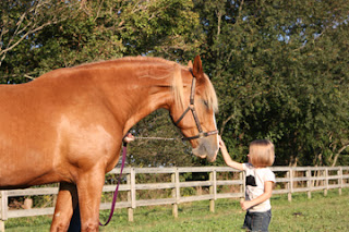
This week I begin working on a large commission of a chestnut warmblood with a little girl for a client located in New England. She sent the following pics;


I am creating a larger 16"x20" colored pencil piece and have been brainstorming ideas in my head over and over. Since the reference shots are not ideal for compositional planning but still serve as a means to study my subjects' likelinesses, I sought out to take my own quick reference shots. Typically when I receive images from clients for fine art pieces and or illustrative/commercial work, I always end up shooting my own references or purchasing stock etc. In the end I want the best piece possible, one that the client will thoroughly enjoy forever!

I brainstormed a bit with the client over ideas/musings I had. I want to create an image that tells a story, in this case a bond between a human child and a horse. A moment captured! My mind envisions a young girl out in a scenic field with her chestnut gelding interacting in a very gently loving way. I feel having the horse depicted in the stall is too limiting and being able to see him entirely is a key goal. In my mind the image is mostly about the horse so I want him to play the larger role in the artwork and be the central/dominant subject.

My colored pencil work has been collected quietly by many clients over the years and as far as I know I am the only person who works with colored pencils they way that I do. I haven't met anyone who utilizes the methods entirely the way I do yet. Its been a process of trial an error until I perfected the technique that I have come to use. I will be sharing those techniques here!

I haven't a name for my technique yet and everyone is always shocked after seeing my works to learn that it is colored pencil I am using. Most people think its either oil pastel or acrylic until I tell them otherwise. I will be documenting my step by step progression on this piece here on my blog. I am really trying to make a valid attempt at documenting everything and showing everyone what I do.

Since leaving the teaching world I have been able to focus entirely on my art and photography and for the first time ever I am doing what I love and loving every minute of it. While I was teaching I was rather quiet about my art career as I didn't want to create a "conflict of interest" especially since in the commercial realm some of the subjects I work with  are adult natured, I didn't want to ruffle feathers or draw an unnecessary attention my way.

Now, however, I have free reign to create and lately I feel like the artsy Mad Hatter who has just stepped forth in an explosion of artistic fury and I am liking it! Ah, I digress, now back to the reference shots I took.

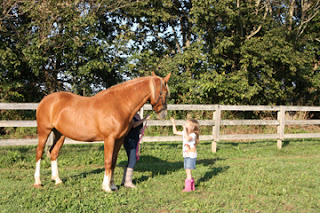
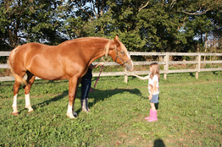
A new boarder at my friend's barn has two little girls, Karlee and Emma and a big chestnut mare. I asked her if she would be willing to allow me to use her girls and her mare Porcia as reference for my artistic endeavors. She was very excited and agreed.

The reference shots were just quick, nothing fancy, no pro photography work, to get concepts and ideas that I had in my head, hashed out somewhat visually so I had something to work from. Of course I did squeeze in a session with the little girls and took some nice pictures of them for their mom as a way of thanking her for allowing me to use them :)


BW version from above


There are still a lot more images from this session :)

 
I took several reference shots of the girls randomly and candidly interacting with their mom's mare Porcia. These shots are not fancy, they merely represent conceptual ideas that are dancing around in my head for this work of art. I am closely studying the horse and her body language a well as the girls'. I must be spot on when depicting emotion and capturing that "magic" moment. The girl's head in the image is going to be facing the horse so her body language and the way she is interacting with the horse has got to be perfect in order for me to tell the story I am wanting to tell.
 
Here are some of the shots (keep in mind that the horse will be the client's horse and not the horse pictured, I am only using her image as a reference source, same goes for the little girl). I have made notations by the images I favor.


This image is my favorite in terms of the horse reaching towards the little girl. I would depict the horse's entire body along with this reach if I choose to use this. The client is also currently looking over the images and will share with me the images here that speak to her the most.

I like the little girls legs and lower portion of her body here in this image

I like the girls upper body positioning and her gently touch on the horse's nose